Visualizing Collinearity
While there are many resources out there to describe the issues arising with multicollinearity in independent variables, there’s a visualization for the problem that I came across in a book once and haven’t found replicated online. This replicates the visualization.
Set-up
Let Y be a response and X1 and X2 be the predictors, such that
for individual i.
For simplicity, let’s say that
I carry out a simulation by generating 1,000 data-sets with a specific correlation between predictors and obtain their coefficients.
reps <- 1000
        n <- 100
        save <- matrix(nrow = reps, ncol = 3)

        for (i in 1:reps) {
        x1 <- rnorm(n)
          x2 <- rnorm(n)
          y <- x1 + x2 + rnorm(n)

          mod <- lm(y ~ x1 + x2)
          save[i, ] <- c(coef(mod)[-1], cor(x1, x2))
          }
The line x2 <- rnorm(n) gets replaced with x2
<- x1 + rnorm(n, sd = _), where the _ is replaced
with difference values to induce more correlation
between x1 and x2.
Simulation Results
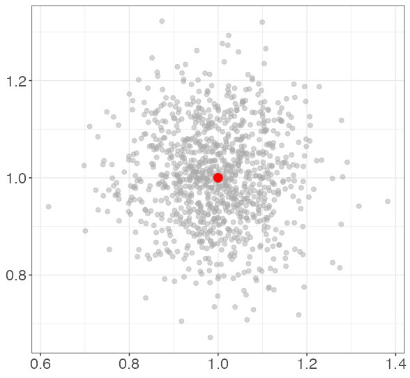
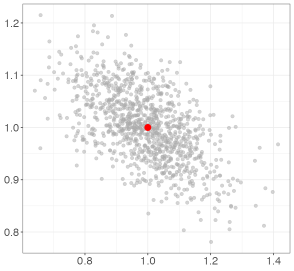
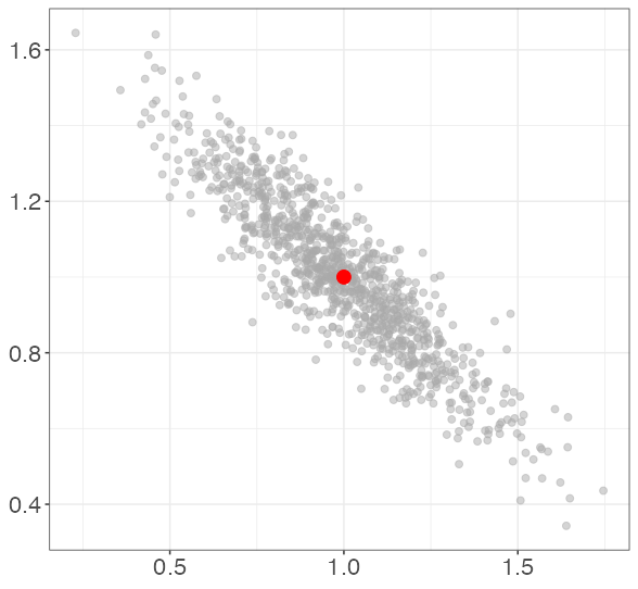
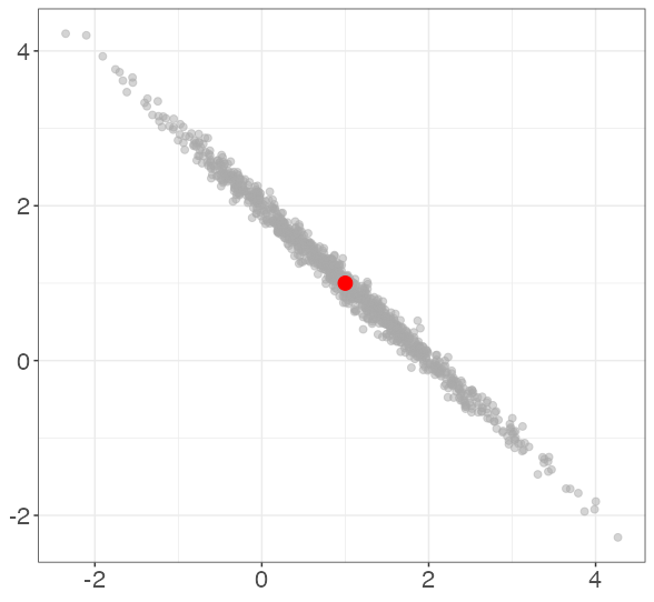
Each point represents the estimated coefficients for a single simulated data set. The red dot represents the data-generating coefficients (1, 1). Note that bias is not a concern; the true coefficients are on average for each level of collinearity.
In this simulation, the average correlation between X1 and X2 is 0.002. 0.554. 0.894. 0.995.
Why is this a problem?
So this simulation shows that at correlations around .9 or higher between X1 and X2, there is negative correlation between and . Why is this a problem?
Consider the “extremely high correlation” results. With such high correlation, we have that We can use this approximate equality to rewrite the model:
In other words, the model has that (since we assumed above that both coefficients have values of 1). So while all of those models would have the same predictive power for Y, they would have drastically different interpretations. For example, we could obtain and , which not only over-emphasizes the relationship betwen X2 and Y, but suggests a inverse relationship between X1 and Y!